ELISSA DAVIS DESIGN
About
Logos
Icons & Graphics
advertising
social media
digital banners
Collateral
Packaging
Trade shows
Signage
Contact
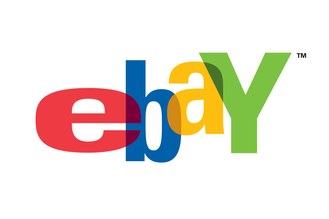
Everyone knows this logo, and YES I did design it. Heartbreaking that they redesigned it in a generic version. Originally, eBay wanted a fun, involving mark that would convey a feeling of community. I also thought it should capture the random nature of eBay’s endless array of products. I was inspired by the colors in the old Apple logo and by the game Twister. Then I let the colors overlap and blend, lending a feeling of playful interaction.
Eathos is a national foods company. The logo is a flourish of lightness, color and good food. The vine illustration represents a growing bounty of flavor and nature. Simple iconography is messy yet clean.
ClearingBid is a new network that opens investing for all by revolutionizing the IPO investing process.
Smidge is a small batch probiotic supplements company. This friendly, approachable logo comes in multiple color combinations to span their product line.
K3 stands for three Kauffmans in a family owned construction business. We wanted the logo to evoke the honest integrity of their brand. What better way to do that than show a sturdy sign type logo that evokes strength, goodness and approachability.
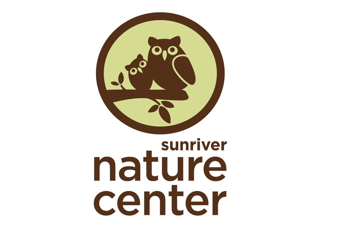
The Sunriver Nature Center is a non-profit, educational organization. Kids can explore nature, view animals up close and participate in programs. In 2012, I was hired to update their logo to a friendlier, more modern look.
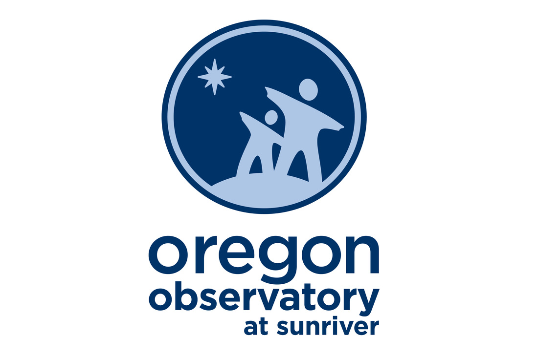
The Oregon Observatory in Sunriver is a non-profit, educational organization. The Oregon Observatory is the largest public astronomical viewing facility in the United States. I wanted the logo to represent a family viewing the stars.
Sunriver Nature Center & Observatory's 50th anniversary logo. I combined both logos in a celebration of energy.
Anew Vibe logo is for a yoga studio that also sells crystals. The lotus is the symbolic of meditation.
Lessons Lived is an online self-help space. LessonsLived.com delivers personal growth. It’s the natural, ongoing progression of awareness, learning, perseverance, and progress.
The Echoic Golf logo was designed for a golf club creator. This club is a training tool that makes a distinct sound when you hit it just right. We wanted this logo to have a cutting edge, high tech yet approachable design that will stand out from the crowd.
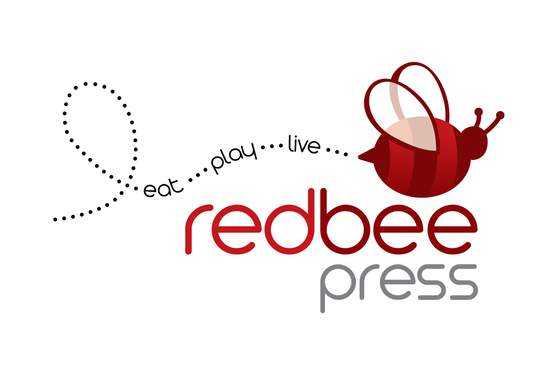
Red Bee Press is a high end coupon book in Central Oregon. We wanted it to convey fun, active and easy.
Logo for CBD products marketed to mainstream customers
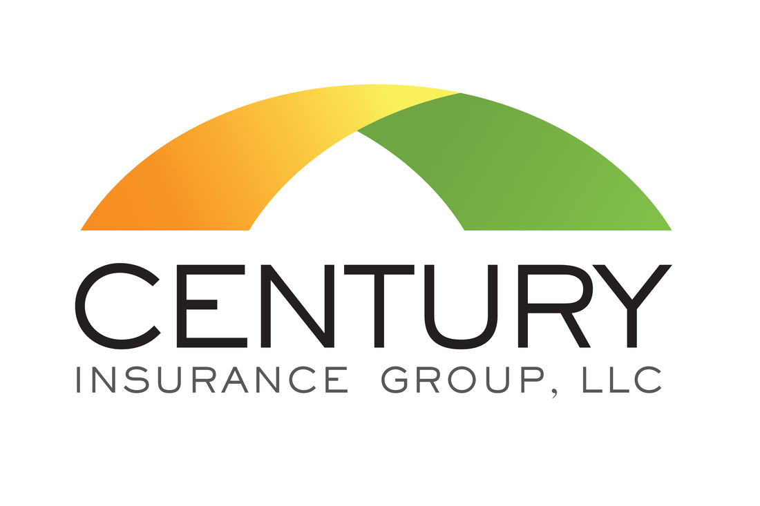
The Century Insurance icon bridge emulates the expanse of insurance coverage. Family based company that happens to love the Ducks and Beavers - so they loved the colors.
Craters of the Moon National Park is a vast ocean of lava flows with scattered islands of cinder cones and sagebrush. Their centennial logo needed to reflect the landscape and colors.
Malibu Country Club was getting a major make-over. To compliment the course improvements, the new owners requested a more modern, upscale logo design. After a couple days at the beach I found my inspiration. After all, it was Malibu.
SaleFish is an online software that connects real estate property to people, and connects buyers and sellers directly in a streamlined process.
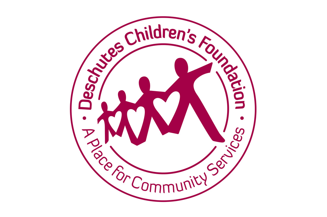
The Deschutes Children's Foundation manages non-profit service centers for children and families. I was commissioned to create their 25th anniversary logo - their original logo was a harsh paper cutout and I redesigned it to show hearts inside the negative space.
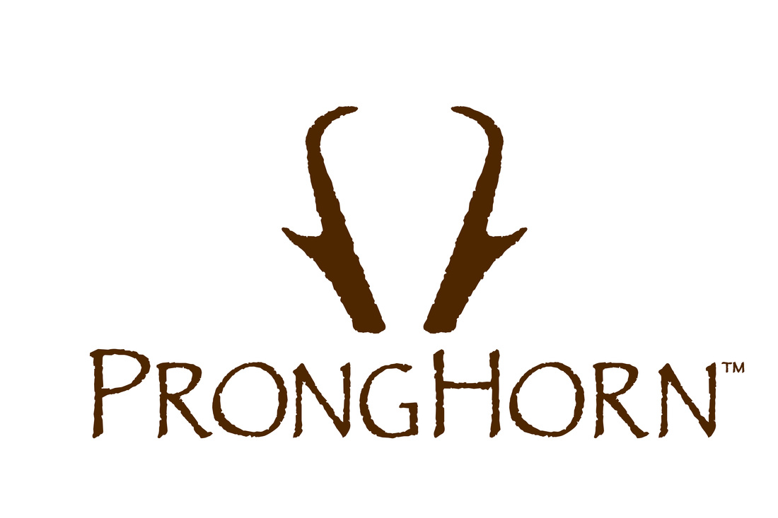
Pronghorn is an exclusive golf community. This simple execution appears on everything from the front gates, door handles, furniture, residences fireplaces and of course golf merchandise.
SalesGym is personalized sales training online.
Zoomerang was an online survey company.
Logo for Golf Academy in Florida
Poptuit brings together all your favorite communications tools into a single super-app. Then Poptuit adds all kinds of social stuff to make connecting with friends, family and co-workers simpler, smarter and a bunch more fun.
Salon Twist is an upscale hair salon that wanted a playful yet sophisticated logotype solution. Incorporating a bold yet playful script font that I manipulated to have more of an exciting form with a adventurous purple color was just what they needed.
Silicon Valley Cares raised funds for non-profit companies benefitting children, teens, animals, homeless, as well as crisis situations within the Santa Clara County. Annual Halloween fundraiser evoked a spooky branding theme.
Neurology of Bend is a medical facility devoted to conditions of the nervous system. I wanted to convey the neurological synapses in the EEG testing.
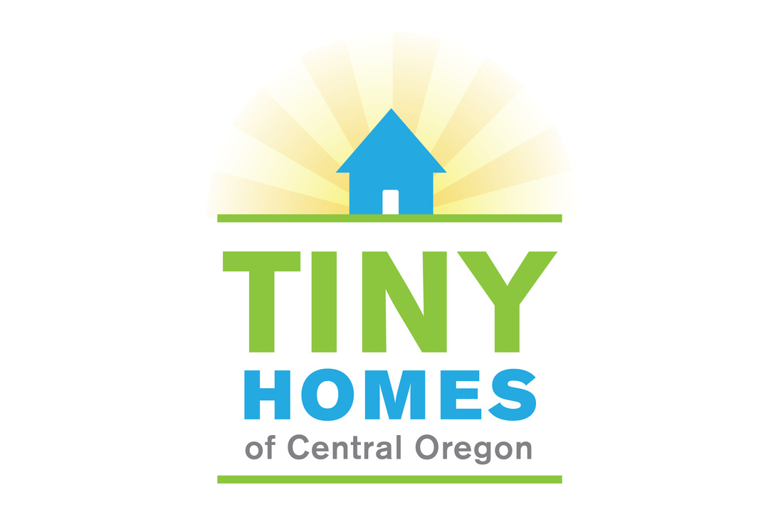
Tiny Homes of Central Oregon is part of a new movement to create affordable housing. They are tiny, cute and very easy to build.
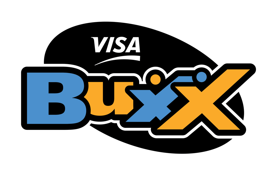
Visa Buxx was a debit card designed to teach 13-16 year olds how to use money wisely. The logo needed to be young, fun and cool, so I added a hint of the X Games to make it exciting.
About
Logos
Icons & Graphics
advertising
social media
digital banners
Collateral
Packaging
Trade shows
Signage
Contact